Type Design

Mai Type
Mai Type is a type design practice where I create retail and custom fonts, and a space to house my research on Vietnamese typography.
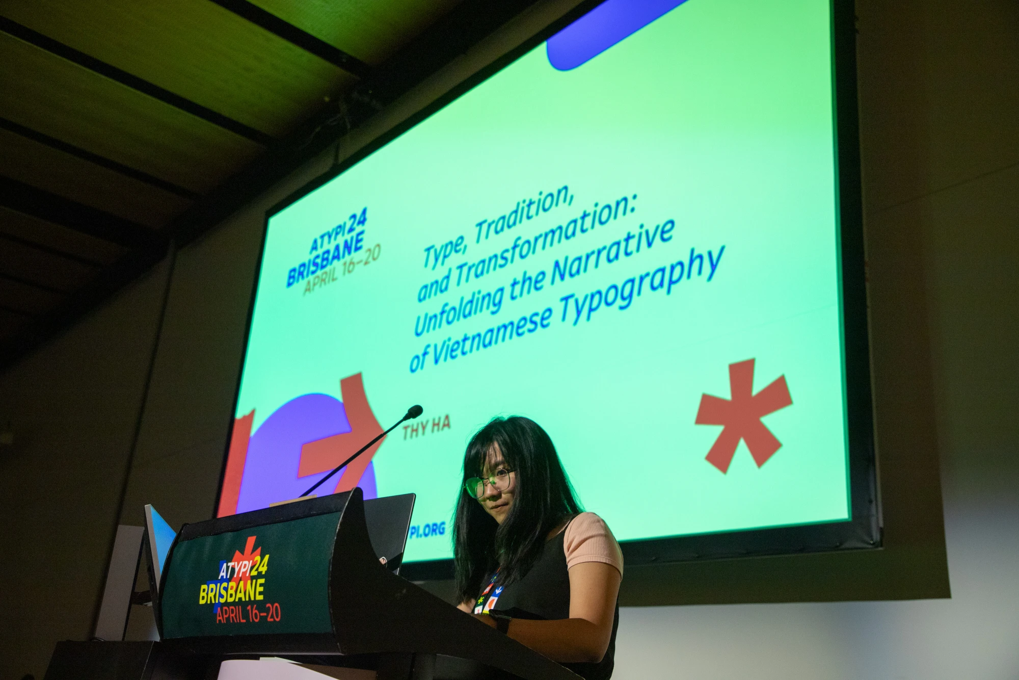
ATypI Brisbane 2024 Speaker
Representing Lưu Chữ, my Vietnamese typography collective, I shared the group’s journey in preserving the cultural essence of Vietnamese typography amid modernisation, along with our research into its documented evolution.
Counter Forms Launch Panel
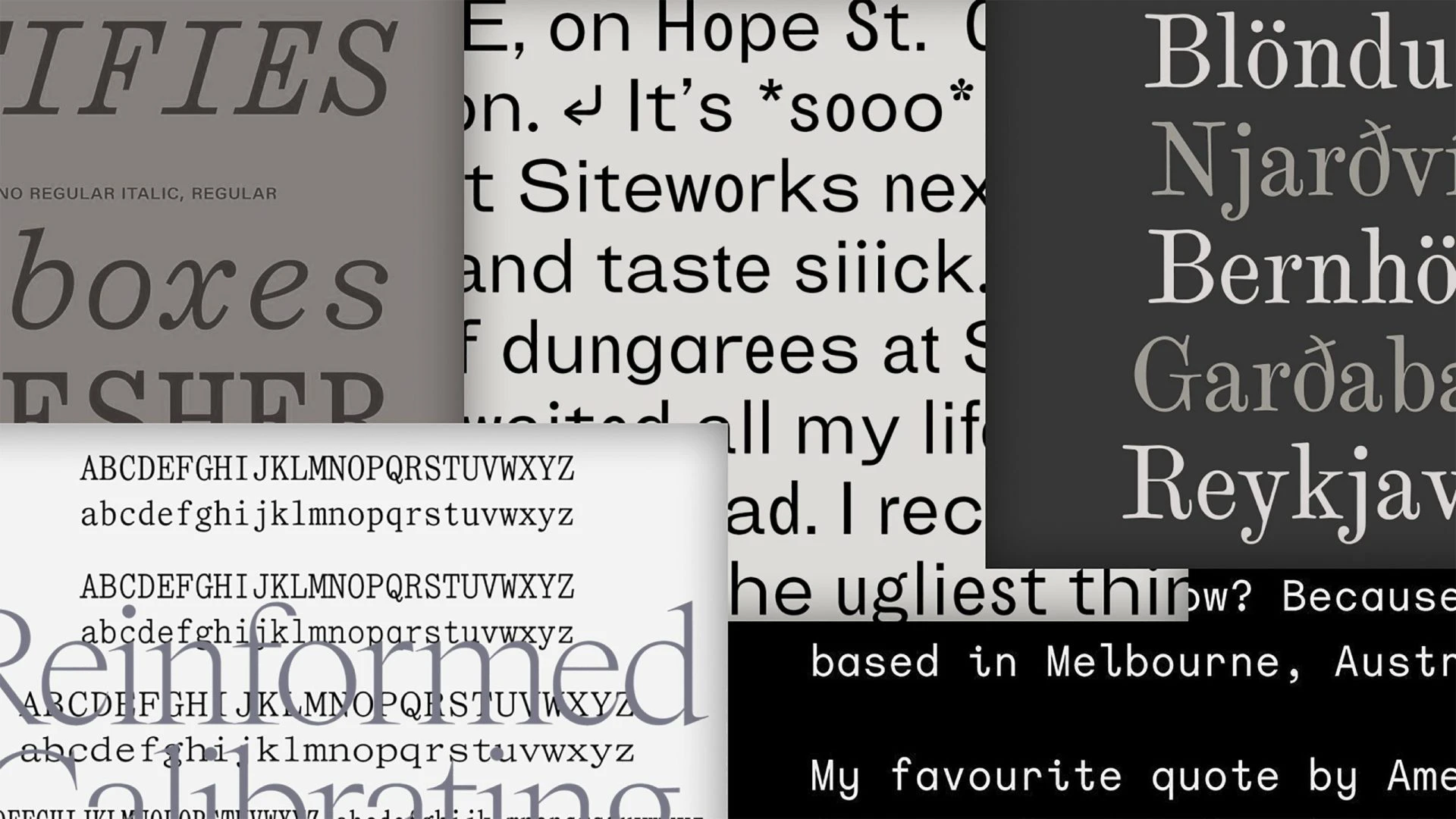
Counter Forms is a new typographic venture that champions young, discursive Antipodean type designers. I was honoured to contribute as a member of the collective and take part in the launch panel at the Melbourne Art Book Fair 2023.
Forward to the Past
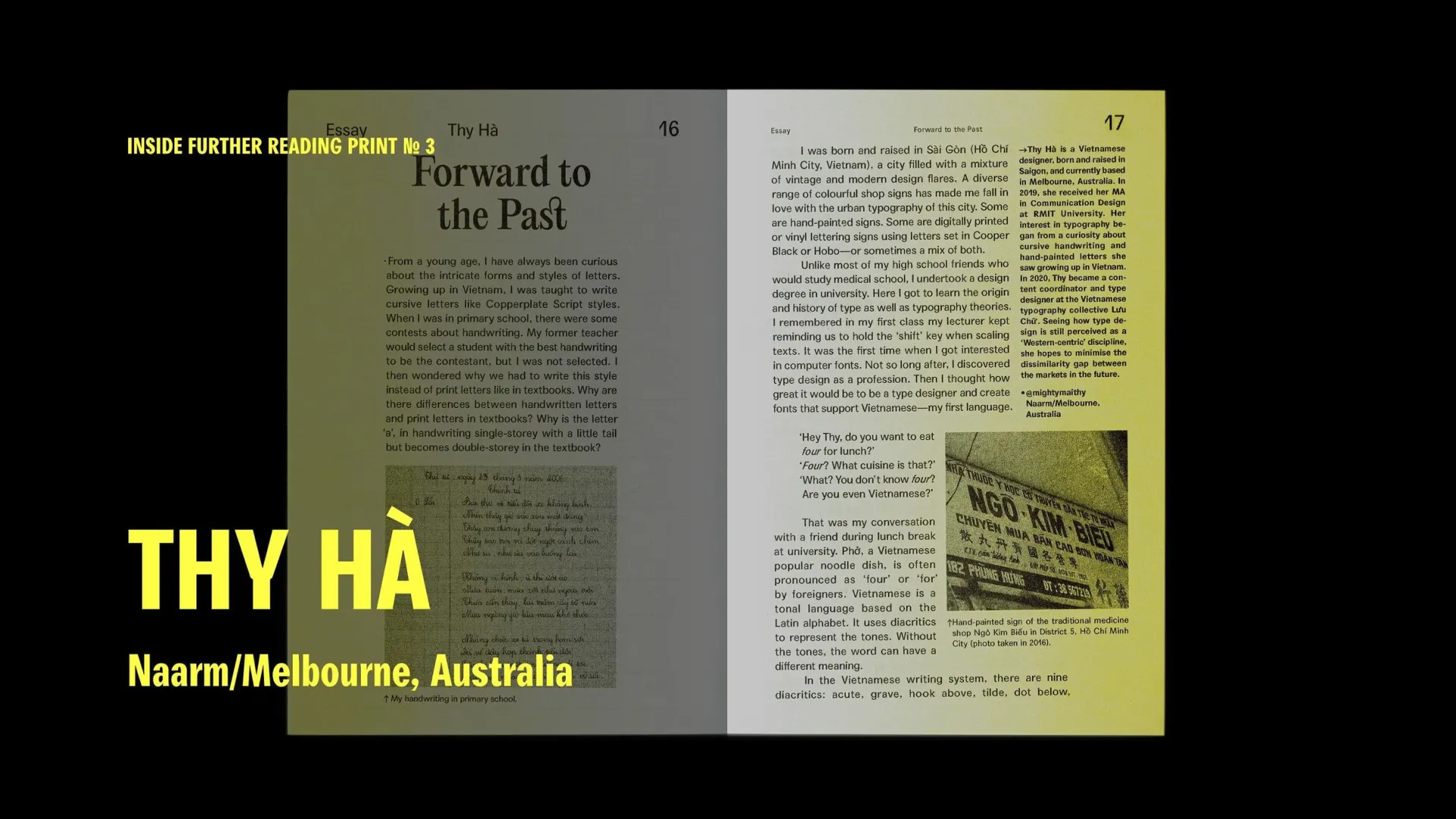
In Further Reading Print No. 3, I contributed an essay titled "Forward to the Past", reflecting on Vietnamese typography and my journey into type design. Acknowledging that type design is still largely viewed as a Western-centric discipline, I hope to help bridge the gap between markets in the future.
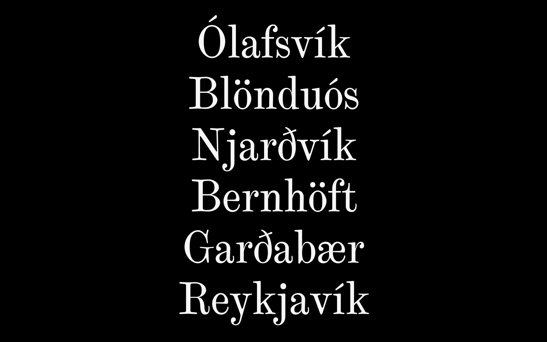
Typographic solution for Rarau mai Living city
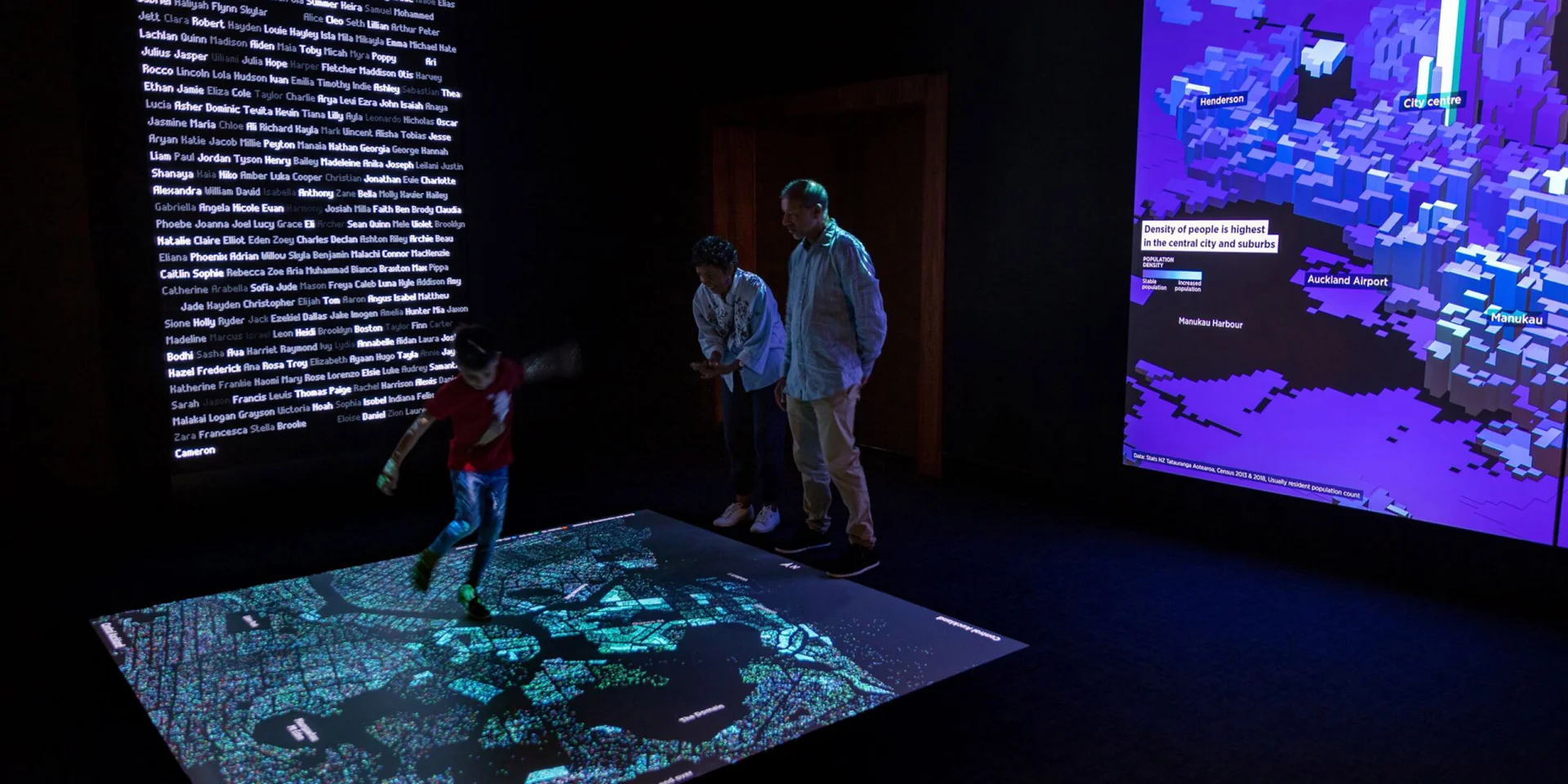
Typographic solution with Māori language support for Rarau mai Living City, an immersive exhibition exploring Auckland through data. Created by Auckland War Memorial Museum, OOM Creative and Michael Dunbar.
The Malee Scholarship 2021 Finalist
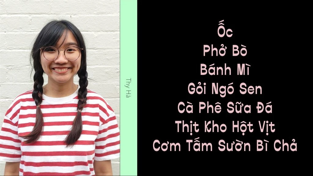
The Malee Scholarship is a scholarship fund initiated and funded by Sharp Type, to support and empower women of colour in type design field.
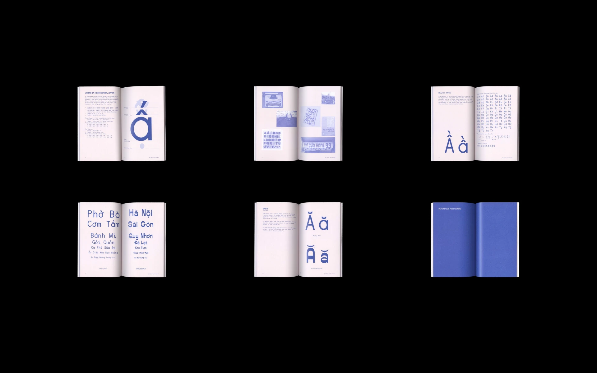
Up? Down? Left? Right?
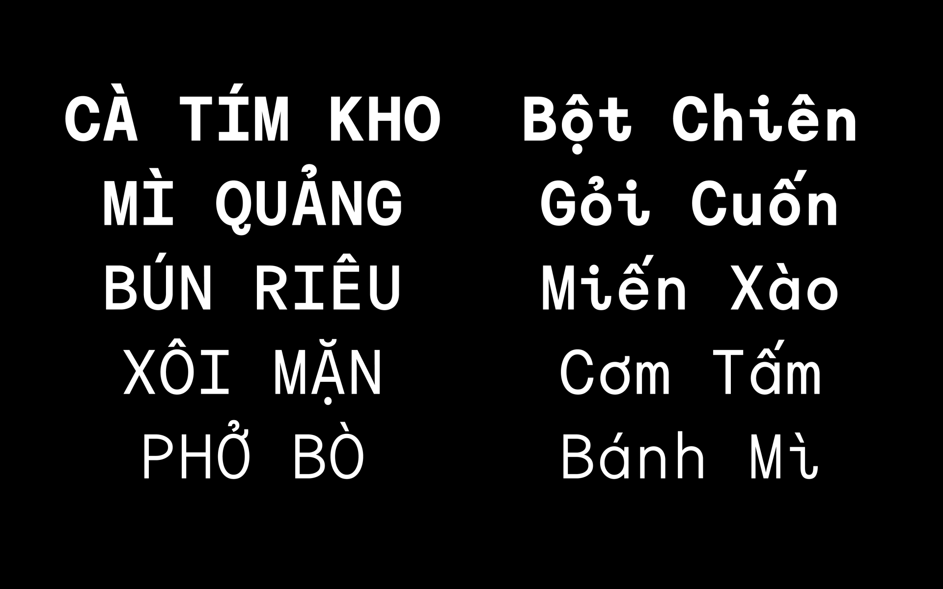
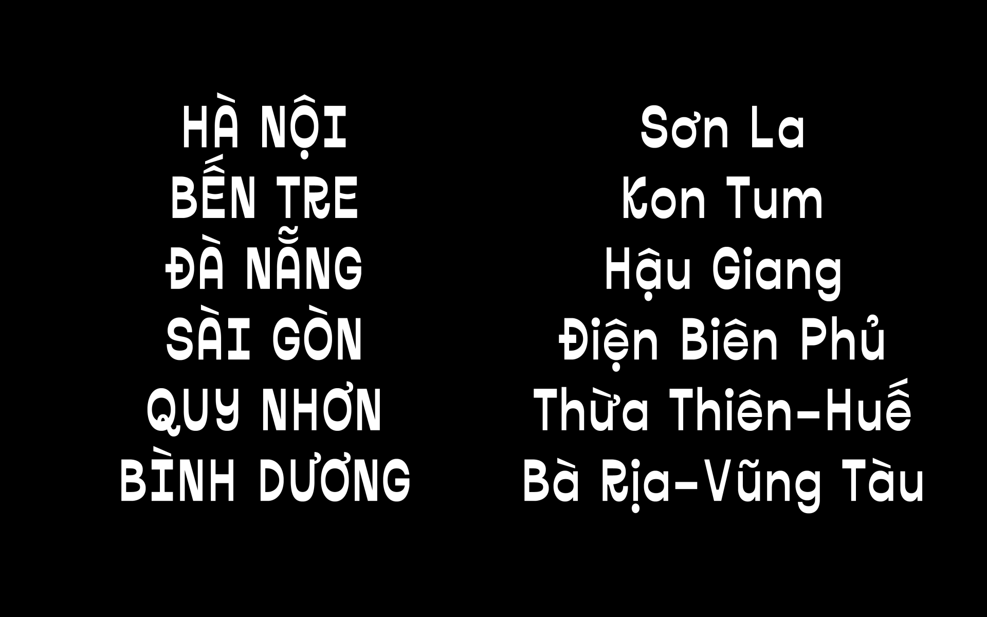
Master’s research project on the design of Vietnamese diacritics, completed in 2019 at RMIT University. The project aims to provide a reference framework for typographers, type designers, and graphic designers by examining the historical context and proper positioning of diacritics. It also includes the practical development of two typefaces: Mighty Mono and Untitled Display (now released as Mai Display).
